Turning complex civic data into an engaging, human-centered digital experience
When the Hoover Institution, part of Stanford University, approached us, the challenge was not simply to build a website. The goal was to turn a complex civic research and assessment platform into an experience that felt clear, engaging, credible, and approachable for a wide range of users.
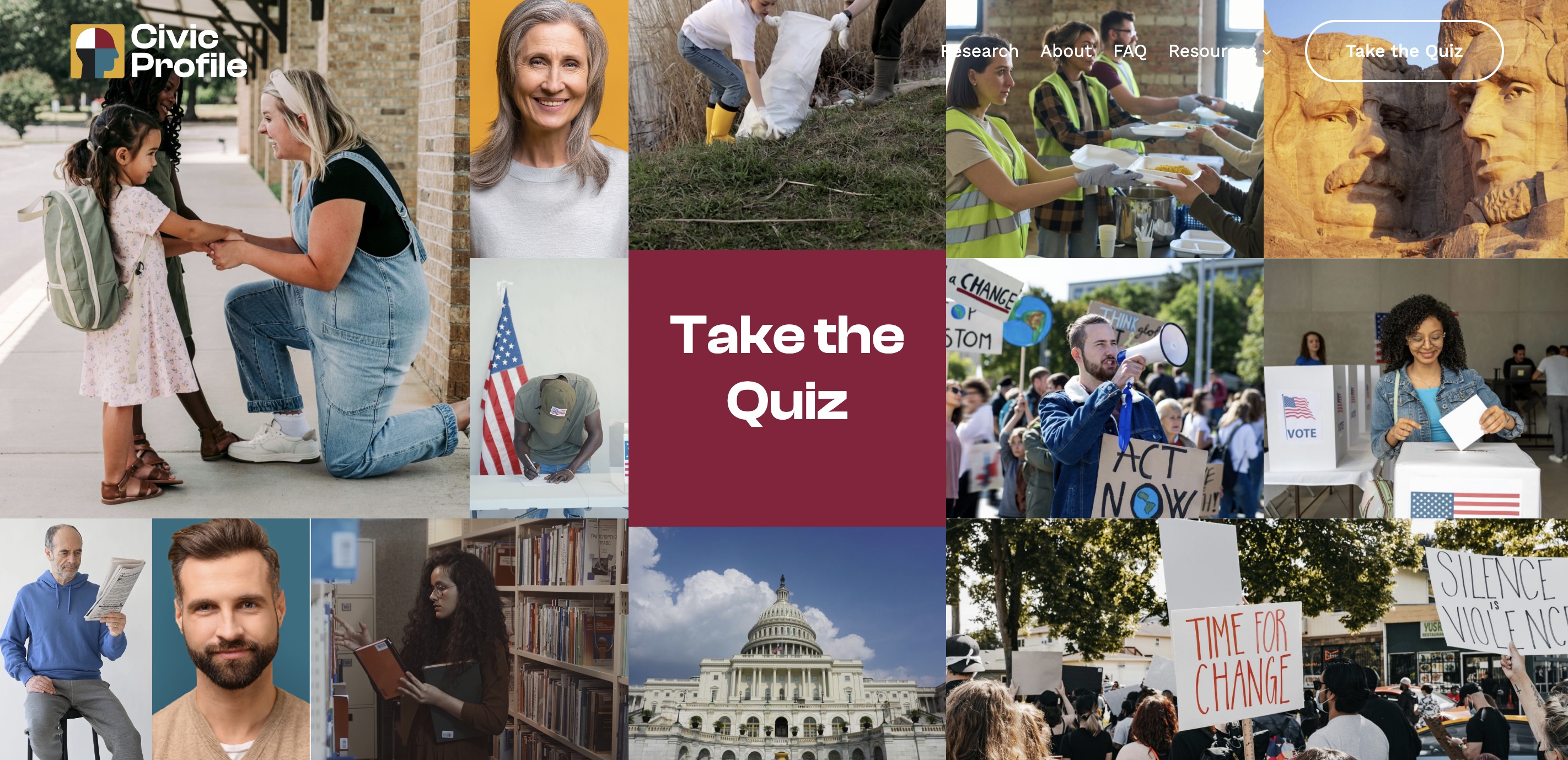
What became Civic Profile is more than a public-facing website. It is a thoughtful digital platform that combines branding, UX strategy, front-end development, and data visualization to help users better understand how they engage with civic life.
For nonprofits, universities, think tanks, and research-driven organizations, projects like this are becoming more common. Audiences expect more than static content and PDF downloads. They want interactive tools, intuitive navigation, accessible design, and meaningful experiences that make complex information easier to understand and act on.
The Challenge: Translating a Complex Civic Tool Into a Public-Facing Experience
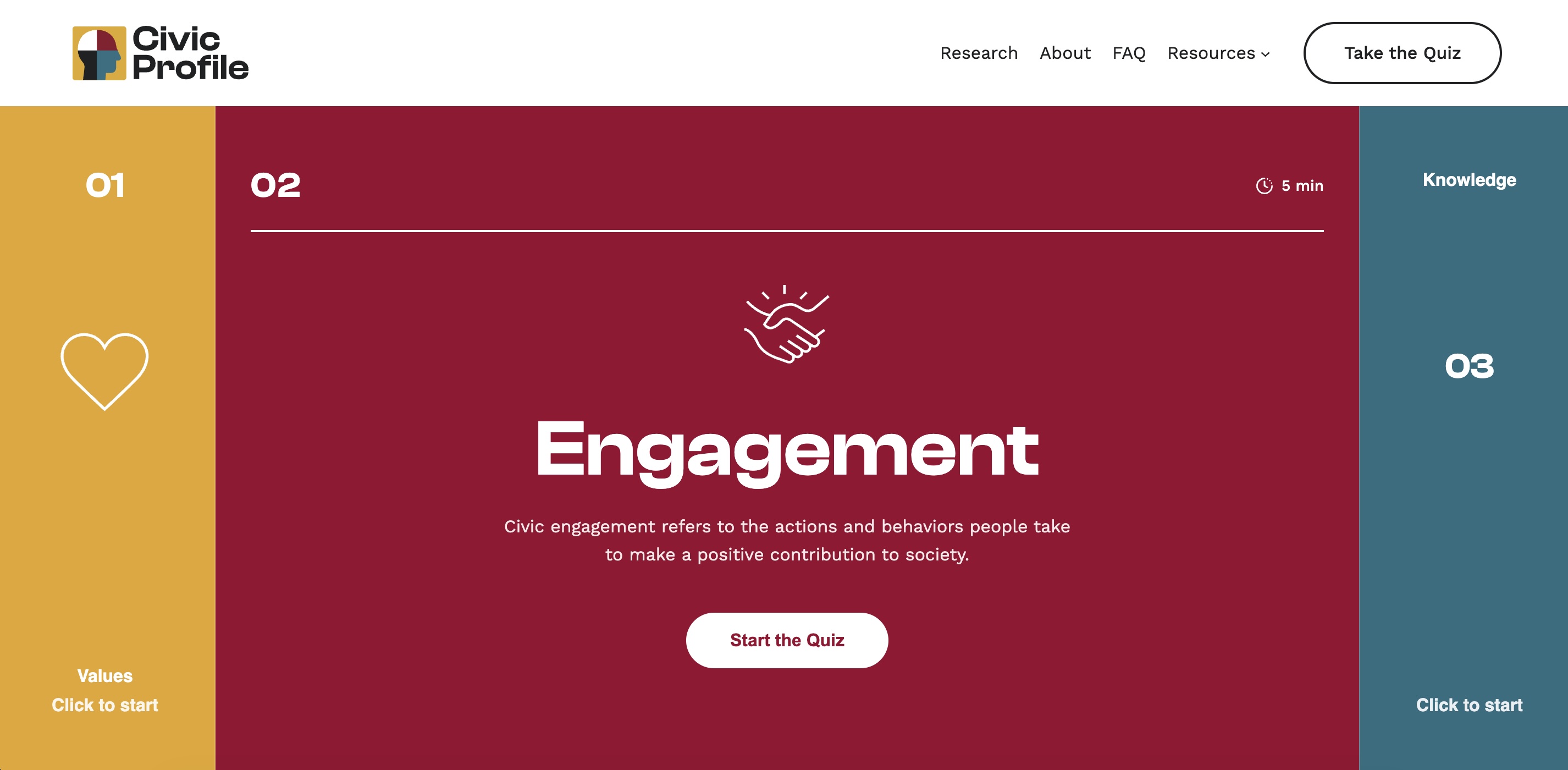
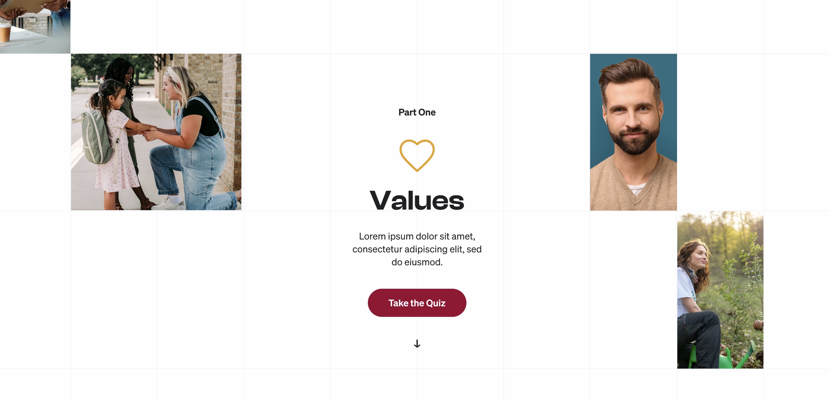
Civic Profile was designed to help users explore how they relate to civic life through a multi-part assessment experience. The platform evaluates users across three key areas: values, knowledge, and engagement. After completing the assessment, users receive a personalized profile that blends data, narrative interpretation, and visual feedback.
That may sound straightforward on paper, but in practice, it required solving a number of challenges at once:
- Creating a smooth multi-step assessment flow
- Designing for multiple audience types, including students, educators, and the general public
- Presenting data in a way that was both credible and easy to understand
- Building a platform that felt modern and engaging without losing academic integrity
- Creating a scalable system that could grow over time
This is where many nonprofit and university projects struggle. The content may be valuable, but the delivery often feels dense, dated, or overly technical. When that happens, even strong ideas lose momentum online.
Starting With User Experience, Not Just Design
Before moving into visual design, we focused on user flow. For a platform like Civic Profile, the experience has to guide users clearly from start to finish. If the path feels confusing, too long, or too heavy, users drop off before they ever reach the most valuable part of the tool.
We mapped the full journey from onboarding through survey completion and personalized results. The goal was to reduce friction, make progress feel visible, and help users stay engaged throughout the process.
Instead of overwhelming visitors with too much information at once, the platform breaks the experience into manageable steps. That structure helps users feel oriented and supported, even as they move through complex ideas and personalized outputs.
For nonprofits and educational organizations, this is a critical lesson: good UX is not decoration. It directly affects participation, comprehension, and overall impact.
Designing for Credibility and Approachability
One of the most important parts of this project was finding the right visual balance. Civic Profile needed to feel serious enough for a Stanford-affiliated research initiative while still being approachable for everyday users.
That meant avoiding two common traps. On one end, academic tools can feel overly formal, dense, and intimidating. On the other, trying too hard to feel casual can undermine trust and make a platform seem less rigorous than it actually is.
Our approach focused on clean typography, thoughtful spacing, clear hierarchy, and a modern visual system that helped the content breathe. The interface supports the depth of the subject matter while still feeling inviting and easy to navigate.
For organizations working in research, education, public policy, or mission-driven work, this balance matters. A website can be both authoritative and usable. In fact, it needs to be.
Making Data Easier to Understand
One of the most interesting parts of Civic Profile was the data visualization component. Users are not simply completing an assessment and receiving a block of text in return. They are getting personalized outputs that help them better understand where they land in relation to broader civic patterns.
To support that, the platform required clear, digestible visualizations that could communicate insights quickly. These kinds of tools work best when the design helps users understand the meaning behind the data, not just the data itself.
That distinction is important. Many organizations have strong information but weak presentation. Charts and dashboards alone do not create clarity. Users need context, structure, and intuitive design in order to interpret what they are seeing.
For nonprofits, universities, and research institutions, this is often where digital projects can deliver the most value. When data becomes easier to understand, it also becomes more useful, more engaging, and more shareable.
Building a Brand Around the Platform
Projects like Civic Profile often require more than web design and development. They also require a clear identity.
As part of the process, we helped shape the creative direction around the platform itself, including how it should look, feel, and communicate. That kind of alignment is especially important for mission-driven organizations, where the brand experience needs to reinforce trust, clarity, and purpose.
When a platform has a strong identity, it feels more cohesive from the first interaction through the final result. Users understand they are part of something intentional, not just clicking through a utility.
For universities and nonprofits launching new programs, assessments, resource hubs, or public-facing tools, this is often an overlooked opportunity. A stronger brand system can improve usability, recognition, and confidence in the platform as a whole.
Planning for Growth and Long-Term Use
We also approached Civic Profile with long-term usability in mind. A platform like this cannot be treated as a one-time marketing page. It needs to be maintainable, flexible, and ready to evolve as the organization’s needs change.
That meant building with scalability in mind, including reusable components, content management flexibility, and a technical foundation that supports future enhancements. Accessibility, mobile responsiveness, and performance were also key priorities throughout the build.
For nonprofits and higher education organizations, this matters because digital platforms often grow over time. New cohorts, new content, new program needs, and new audience expectations all place demands on the system. A smart build should support that growth rather than fight against it.
What This Project Shows for Nonprofits and Universities
Civic Profile reflects a broader shift we are seeing across nonprofit, educational, and research-driven organizations. A website is no longer just a place to publish information. It is often the primary way people experience your mission, your work, your research, and your tools.
That means organizations need more than a nice-looking site. They need digital experiences that do a few things well:
- Present complex information clearly
- Guide users through structured interactions
- Build credibility without creating friction
- Support long-term growth and content management
- Reflect the quality of the institution behind the work
When those pieces come together, a website becomes more than a communication tool. It becomes a platform for engagement, education, and impact.
Final Thoughts
One of the biggest challenges facing nonprofits and universities today is not a lack of valuable information. It is the difficulty of translating that information into experiences people will actually use.
Civic Profile is a strong example of what can happen when strategy, design, and development are aligned around that goal. The result is a platform that helps users engage with complex ideas in a way that feels intuitive, meaningful, and modern.
For organizations building assessment tools, research hubs, educational platforms, or mission-driven digital experiences, the lesson is simple: good design is not just about aesthetics. It is about clarity, trust, usability, and impact.
If your organization is trying to turn a complex program, research initiative, or public-facing tool into a better digital experience, that is exactly the kind of work we love to do.
Looking for a Website Partner for a Nonprofit, University, or Research Initiative?
We design and build custom digital platforms that help mission-driven organizations communicate clearly, engage users, and grow with confidence. If you're planning a new website, interactive tool, or research-driven platform, we'd love to talk.